Responsive Web Design in 2025: Best Practices
“If you think good design is expensive, you should look at the cost of bad design.”
That's right— A good design is great for the bottom line and a responsive web design is far from a passing trend. It’s a critical aspect of modern web development, and its impact on user experience, traffic, and SEO cannot be overstated. That's why responsive design is such a "big deal" in web design right now.
What is Responsive Web Design and Why is it Important?
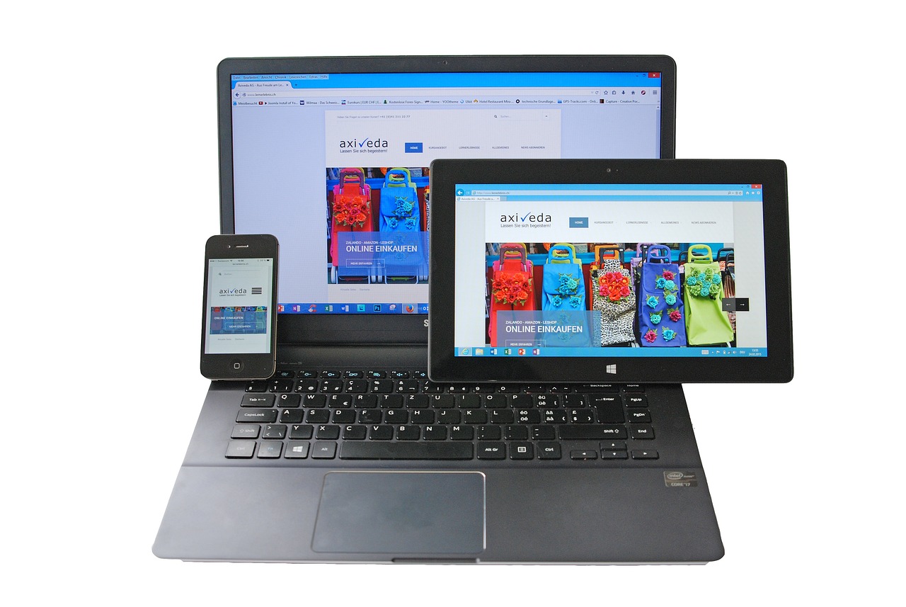
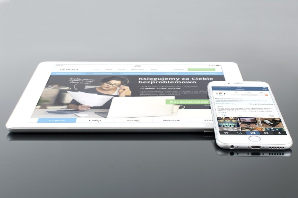
Responsive Web Design (RWD) is an approach to web design aimed at creating websites that provide an optimal viewing experience across a wide range of devices. This includes desktops, laptops, tablets, and smartphones, by ensuring that the website adjusts and adapts its layout, images, and content to fit the screen size of the device.
Responsive Web Design is crucial because it ensures your website adapts seamlessly to all devices, from desktops to smartphones. With more people browsing on mobile, a non-responsive site can frustrate users, leading to high bounce rates and lost traffic.
It also boosts SEO, as search engines like Google prioritize mobile-friendly sites, improving search rankings and driving more traffic. Additionally, responsive design is cost-effective, requiring less maintenance than separate mobile and desktop versions. As new devices emerge, responsive websites stay relevant without major updates, leading to better user satisfaction and higher conversion rates.
Essential Responsive Web Design Best Practices
Approximately 90% of websites today have already implemented some form of responsive design. The shift toward mobile browsing has fundamentally changed how users interact with the web, making it critical for websites to prioritize mobile-friendly design.
Here are some best practices for Responsive Web Design to ensure your website is user-friendly, fast, and optimized across devices.
- Mobile-First Approach: Design for the smallest screen first (mobile) and then scale up for larger screens (tablets, desktops). This ensures that essential content is prioritized, and the site is optimized for mobile users from the start.
- Use Fluid Grids: Avoid fixed-width layouts. Instead, use percentage-based widths (fluid grids) so that elements scale relative to the screen size. This ensures content adapts fluidly to varying screen dimensions.
- Use Scalable Images: Use flexible images that can be resized to fit different screen sizes and Optimize images for faster loading times.
- Use Media Queries: Media queries are a CSS technique that enable designers to create responsive web designs by applying different styles based on conditions such as browser width, color capability, resolution, and orientation.
- Test Across Devices and Browsers: Regularly test your site on a variety of devices, screen sizes, and browsers to ensure the experience is consistent. Tools like Chrome's Developer Tools or online emulators can help, but testing on real devices is crucial.
- Avoid Fixed Position Elements: Avoid using fixed-width containers or position elements that don’t scale well. Instead, opt for flexible layouts to ensure content adapts as needed.
- Viewport Meta Tag: Always include the viewport meta tag in your HTML, as it helps control the layout on mobile devices. This tells the browser to adjust the page’s width according to the device's screen size.
- Typography and Readability: Use scalable fonts and adjust line lengths for readability across different screen sizes. Keep font sizes appropriate to the screen size (larger for mobile).
Stay Ahead with Responsive Web Design
By following responsive design best practices, developers, designers, and business owners can build a website that is both visually engaging and highly functional on all devices, helping businesses enhance user experience, stay competitive, and achieve their objectives efficiently. A successful website begins with a responsive design, ensuring seamless performance, user engagement, and accessibility across all devices.
If you need assistance with implementing responsive design or have any questions, don’t hesitate to contact us at Onetikk.